NJdatabook is an interactive data tool including statistics and information on New Jersey’s 565 municipalities, counties, school districts, elections, people, and more.
Reasons for NJ databook Update
- To engage existing users.
- To provide better data representation of the data.
- Help users in the decision making process.
- To improve the user experience.
Design Process
- User Research
- Data Analysis
- Ideation
- Prototyping
User Research
I evaluated the current website on the basis of design principles and heuristics. I also researched other websites with similar content. I read the feedback of existing users of NJdatabook on the website. Identified relevant information and organized them into affinity diagrams.
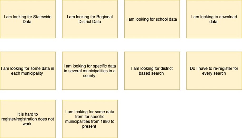
Findings
- Currently, there is no way to save your search. Even if you just want to add one more municipality to your search result, as soon as you go back, the page refreshes and you have to do it again.
- Purpose of Quick profile search is not clear and hence seldom used.
- It is not clear to the users that NJdatabook provides data about Municipalities primarily. People are looking for district data.
- Some users have trouble registering to the system.
- Users are looking for data to download.
- Users are looking for statewide data which can be accessed in the current website, but it is not clear to the users
Testable Hypothesis
- Users will either want to have statewide data or municipality data.
- Users will want to revisit NJDatabook again if their search is saved on their dashboard.
- Users will want to see the graphical representation of the indicators for their search query.
- Users will want to compare municipalities in a particular county based on the indicators selected.
- Users will be interested in “trends over time” of selected indicators for each municipality.
Ideation
I used an iterative process for the prototyping, starting by creating design concepts on paper. I brainstormed different ideas for the re-design.
Concept 1 – Saving the search query on the existing interface. The current app requires users to create an account to search the NJDatabook. So the idea was allowing users to save their search query by keeping the geography and indicators selected on the UI. Also, creating some data visualizations for the results of the query along with data to download.
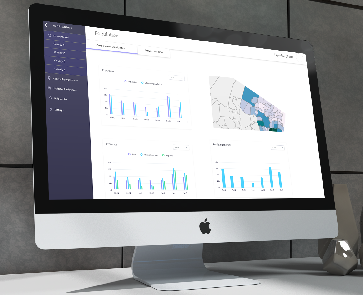
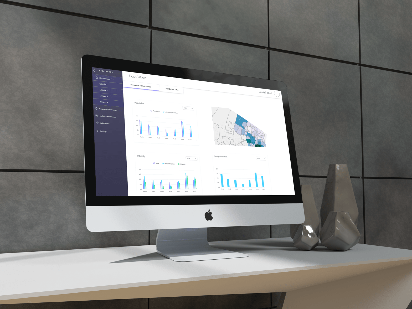
Concept 2 – A personalized dashboard that saves user preferences for later use and creates data visualizations on a dashboard. The visualizations will be based on indicators and geography selected by the users. The visualizations will remain saved in the dashboard, so the users can easily return to the data the next time they log in.
Concept 3- A customizable dashboard where the users will be allowed to create their own data visualization dashboards(multiple ones) based on the selected data with the flexibility of selecting sub-indicators, time ranges and geographies of their choice. Users will be able to name their dashboards and maintain those in their profile.
I selected concept 2 because it is technically more feasible and something innovative providing the users with the ability to make decisions using the NJDatabook instead of just downloading the data.
Prototyping
NJDatabook is a huge source of data, the search can be made by a county, congressional district, legislative district or school district. But in the end, the user is basically selecting one or multiple municipalities. The second part of data is the indicators, there are 12 indicators each having several sub-indicators.
The considerations for data visualizations were relationship, composition, and comparison. For this reason, I combined the sub-indicators wherever possible to make meaningful relationships. For example in the population data, there were separate sub-indicators for Hispanics, African Americans, and Asians. I combined them to call Ethnicity to create graphs that could compare these indicators for several municipalities in a county.
I also introduced the Trends over time graphical representation allowing users to identify the changes visually over the years. Introduction of a map for the representation of geographical data was another choice that I made.
Medium Fidelity Prototypes